Looking at the web stats for this blog, this year so far 13% of visitors have been using a mobile device. This compares with 3% over the same period from 2011. This is a massive jump. In fact this is a larger percentage now accessing content using a phone than those sitting at a desk using a Mac. (The break down is roughly 8% usage on iPhone and 2% Android for the other mobile devices).
When delivering content to a mobile device, as an R+D team you have three choices:
- Do nothing to your website - let the user "double tap" and zoom and pan
- Design and develop a platform specific "App" - but then, for which platform (iPhone? iPad? Windows? Android?... the list goes on)
- Have a specifically designed UI that is optimised for use on a small screen through the web browser
One thing that you'll notice when visiting
RIBAProductSelector.com on a mobile is that it now automatically redirects to the website
m.RIBAProductSelector.com. This is a different user interface - but the same fantastic technical content. This approach is a principle that has also been recently adopted by
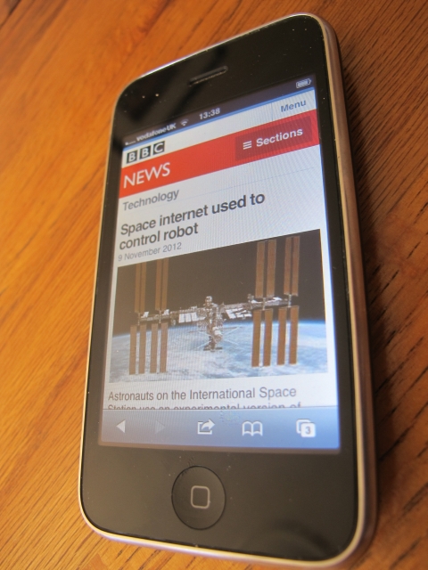
bbc.co.uk/news as shown in the screenshot below:
 |
| BBC News - now redirecting to mobile friendly version |
 |
| Home page |
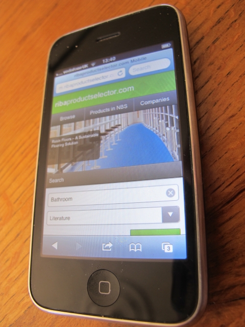
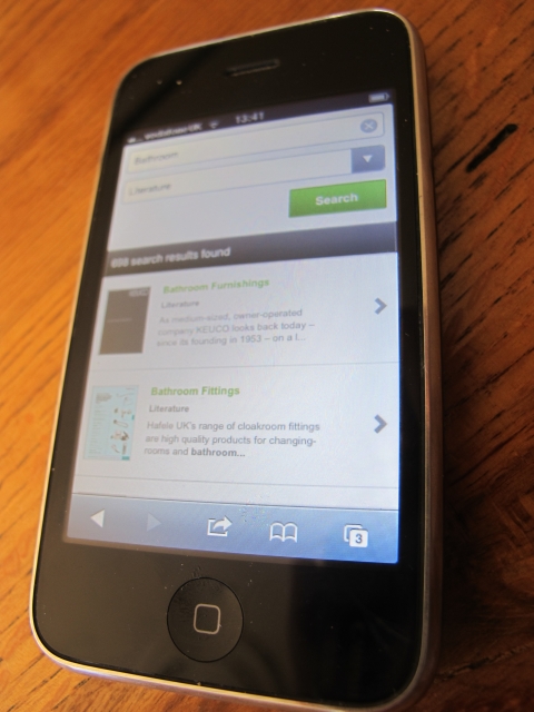
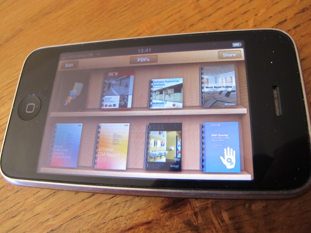
When searching for product literature this works really nicely in terms of finding items and then storing them in your iBooks area of your device (or equivalent):
 |
| Quickly find product literature |
 |
| Save product literature to your mobile device |
Also, if you quickly want to give a manufacturer a phone call or drop them an email - this is possible as the contact details link into the respective features on your device:
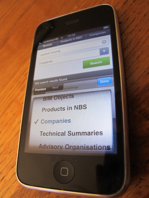 |
| Search for a company... |
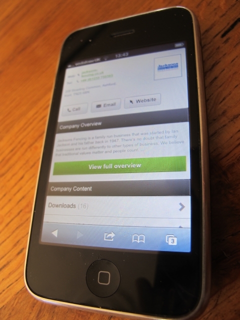 |
| ...and here's my number, call me maybe? |
And of course
RIBAProductSelector.com is not just about literature, product specifications and contact details - there are also thousands of inspirational photographs and case studies. These can all be browsed really nicely on a mobile device.
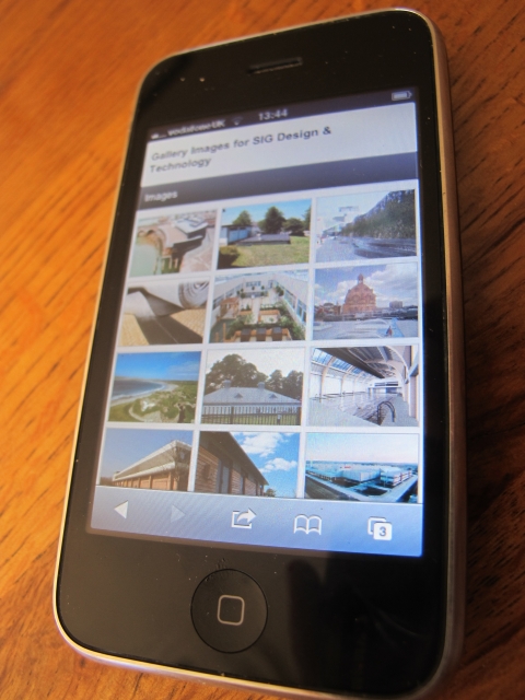 |
| Browse inspirational architectural images |
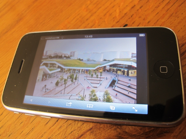 |
| Zoom in on images that are of interest |
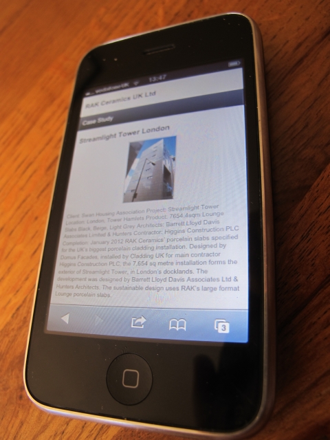 |
| Browse case studies and learn how products have been successfully used |
Members of our R&D team have been working on this for a few months, but it wasn't until I had a good play around with it on my iPhone that I realised how nice the user experience this is on a hand held device.
Finally, finishing on software technology for those interested, there is a new hot topic that is worth looking into and that is "Responsive web design". A single style-sheet that responds to the screen width. Maybe that's a topic for another blog post. A 4th option for future developments?

Site doesn't redirect on a Samsung Galaxy S4 :(
ReplyDelete